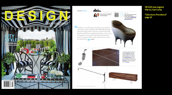
This morning David Brussat of the Providence Journal referred to Studio Providence’s pedestrian bridge proposal as ” the Sopwith Camel Gas Station design.” projo.com
Beginnings are arbitrary, accidental and mysterious. It is hard to know exactly when a point in a process becomes the beginning of something. Moisture, barometric pressure, temperature, currents of air carrying pollen, dirt, crystals of salt off the sea gather and develop a direction and momentum that form fog, a front, a storm or tornado. It separates itself out with identity, a path, force and consequence that serves to replenish, inseminate, or destroy. But when did it begin? Like one weather system morphing into another, the creative process continues and inspires one work after another. Authorship is complicated. Guardianship of an idea is perhaps a more accurate characterization. At what point does intention declare itself if the beginning is arbitrary? At what point is the accident seized? At what point is the mystery recognized and pursued? And by whom?
All of this comes to mind when thinking of one beginning, one set of beginnings, a Rashomon set of stories of beginnings of a project that started more than 35 years ago. The stories, not the authorship of the project, may cohere.
The project involves an idea, the birth of an idea back in the early sixties, in New York. It involves one of countless ideas that went into the making of Lincoln Center, more specifically, the making of the Opera House in Lincoln Center. And more specifically than that, the idea behind the origin of the points of light that drop from its ceiling. I am referring to the design of the Chandeliers in the Metropolitan Opera House.
Metropolitan Opera House Chandeliers
You may have seen them. They make a spectacle at the start of every performance, an explosion of light refracting from crystals that ascend, literally ascend, to the ceiling to announce the beginning of an opera.
Genesis, the ultimate beginning, makes one think of the first book of the Bible for its believers, the origin of the universe as The Big Bang for non believers. Interestingly, physical evidence for The Big Bang was developed at about the same time as the Metropolitan Opera House design was being developed. With optical telescopes, the space between stars and planets is black; but with a radio telescope, a glow is visible; this glow is cosmic radiation. In 1964, scientists explained that this radiation is leftover from the origin of the universe, the first physical evidence of The Big Bang. There was excitement in the media about this discovery. The world was looking up and out into space. The U.S. and Soviet space program was in full swing. This context is the basis of a story of origin of the design of the chandeliers.
About the same time, a year earlier to be precise, The Austrian Government announced that it would make a donation to the new Metropolitan Opera House: a set of crystal chandeliers for its foyer and auditorium. In July of 1963, Hans Harald Rath of J. & L. Lobmeyr, a celebrated Viennese crystal and chandelier manufacturing company, came to New York to discuss the design of the chandeliers with Wallace Harrison of Harrison and Abramovitz, the architect of the Opera House itself.
Three years ago, I met Leonid Rath, the grandson of Dr. Rath at the ICFF. Both Leonid and his brother Johannes are the current head of J. & L. Lobmeyr. Mr. Rath was in New York to begin discussions of the dismantling and cleaning of the Met’s chandeliers. He told me that when his grandfather and WKH met to discuss the chandeliers, Harrison gave Hans Harald Rath a book on galaxies. This book served as inspiration for the chandeliers’ design. The crystals are held by metal rods that radiate out from the center of the chandeliers, making them appear like starburst constellations. They were installed in May 1966 and became known as sputniks, after the Soviet space satellites, from the night the Met opened.
On Sept. 13 1966, 3800 people were in the audience for opening night of the Opera House. It was an exciting evening, the world premiere of Samuel Barber’s Antony and Cleopatra. The first ovation exploded as the curtain was lifted and 21 chandeliers rose toward the ceiling. Wallace K. Harrison, Hans Rath and my father were there. This brings me to a second story of the chandeliers’ genesis.
The genesis of genesis has an Old English origin of gignesthai meaning birth. The etymological dictionary entry states, “be born…see KIN.” While birth is the beginning of one that is distinct; kin carry shared family lines and history.
My father, Tad Leski, far left, with draftsman, and Wallace K. Harrison far right.
My father, Tadeusz Leski is an architect; and a painter. He was a designer for Harrison and Abramovitz. Harrison was a painter and an architect like my father. He was also a statesman, a businessman, and spent time in high profile social circles being [1] linked by marriage, socially and professionally to the Rockefeller family. This consumed his time. My father, who entered H&A in 1953, straight off the boat, so to speak, was a recent immigrant to this country. He had survived the war; fighting as a Pole in the French army getting captured and escaping work camps. He ended up in London where he finished architecture school and had just left England with his wife and young daughter and a portfolio of drawings under his arm. Harrison recognized the artist and architect in my father. They were close because of it. So close, that my father designed and built a house for our family on a piece of property adjacent to Harrison’s own house. It seemed to me that Harrison was drawn to my father and the kind of conversations they could have. They could converse by standing over sketches, marker or pencil in hand. I imagine that my father’s English wasn’t so good back then; but, he could draw beautifully. These exchanges were recluse for Harrison. He got to speak his favorite language of gesture, mark, space and form. It was a respite from the countless board meetings that I am sure Harrison had to attend.
My father was the designer for the Metropolitan Opera House—as he was for many H&A projects. And he prepared the initial design sketches as he always did, countless fast perspective sketches done in marker or ink and white paint washes on trace, vellum or even cardboard. He would meet with WKH and separate them out based upon strengths and weaknesses. The sketches would become orthographic projections—or plan, section and elevation, and models. Eventually the design would be rendered with a ruling pen and gouache.
My father, Tad Leski on the job site of the Metropolitan Opera House. He is standing to the left of Wallace K. Harrison
Along the way, in preparation for one of the meetings, my father was hurriedly finishing a perspective sketch of the Met’s interior. One fault of my father’s was that he never knew when to stop a painting or a drawing until it was too late. He would obsess over the work, changing one thing and adding another until, as he used to say, “he made a mess of it.” His disgust with the work because of the one too many changes, would make him abandon it; and only then it was done. So he was characteristically “finishing” this sketch of the Met’s interior, when a splash of black India ink dropped from his brush right smack in the center of the piece. The splatter extended across the image, resembling an explosion of fireworks. He quickly added lines to attach the splattered droplets and added white paint so that it could be interpreted to be the abstracted points of refracted light projecting from a chandelier.
One of hundreds of interior sketches for the Opera House by Tad Leski
Harrison thought the sketches were great. And he particularly liked the idea of the exploded geometry of the splatter as the form of the chandeliers. An accident was the genesis of the Chandeliers of the Metropolitan Opera House. A drop of ink followed the laws of gravity, surface tension and impact instead of the intentions of the artist. This moment of genesis is suspended like a drop of ink over a page just beyond where my father had intended and before an idea of exploded geometry came to light.
Origins are critical in establishing authorship. But like any beginning, the origin of a work of art or invention is not crystal clear. Constellations, the dots of light in the sky that we connect and name, are imaginary. They inspire myths of princesses, heroes, winged horses and sea monsters. We mentally connect the dots of light as mnemonic devices. Narrative connections serve our imagination and memory. The actual physical locations of these points of light are stars light years away from us, spread out in three and four dimensions. From another point of view, away from the Earth, the constellations would not be recognizable and could not be connected the same way. Different points of view inspire different stories which inform memory and shape what we know.
[1] WKH was married to Ellen Milton, sister in law of John D. Rockefeller Jr.’s daughter, Abby Rockefeller. He was also a friend of Nelson Rockefeller.
I am Alfred DeCredico’s friend and colleague. This chapter of our friendship and colleagueship started with the words, “he’s gone,” on the phone.
Honor him; “yes,” but I am not done with Alfred DeCredico. There are some artists or architects whose work you absorb pouring over pages for years and then you’re full. I did that with Louis Kahn’s work and I’m done. There are friends that part company, move-on—done. I’m not done with Alfred DeCredico. The world is not done with Alfred DeCredico. And I want to think about continuing.
So I made a list. This is A L F R E D V. D E C R E D I C O:
Ask, “What do you think about _________?”
Lobster bisque, a bushel of oysters and seaweed, Osso bucco, peach tart.
Fight the censors.
Recognize the intelligence of others.
Eat the bone marrow.
Drawing is everything.
Vice Versa
Deconstruct chaos.
Elixir of life.
Cohere Entropy.
Really laugh.
Everything isn’t wrong with double negatives.
Don’t hide in the politically correct.
In-tolerate intellectual laziness.
Couragio.
Open mind vices.
_______________________
Alfred DeCredico died on Saturday December 26, 2009. He was an Artist & a Professor of Foundation Studies Drawing at the Rhode Island School of Design. A memorial service was held for him on Saturday, April 10th.
On December 10, the Rhode Island chapter of the American Institute of Architects held its annual awards ceremony at the Narragansett Towers in southern Rhode Island. This year we submitted East Side Addition (Residential), Old Stone House Inn (Adaptive Reuse), Old Stone House Spa and Restaurant (Interior), and Au Bon Pain (Commercial/Industrial) –all four received Merit Awards in their respective categories. Take a look at our submissions and view other winners on AIA/RI’s website.
I had the incredible experience of Pop!tech this past week. The theme was “America Reimagined” and some of the luminaries who spoke were: Dan Ariely, Will Allen, George Church, John Fettermn, Daniel Goleman, Tony Hey,Daniel Nocera, Gideon Obarzanek,Dean Ornish, Katy Payne, Michael Pollen, Reihan Salam, Paul van Zyl, Luis von Ahn, Michael Wesch….
It blew my mind.
Kyna Leski at Pop!tech 2009,
photo by Kris Krüg
I also got the opportunity to make a presentation, that I call, “Cohering Entropy: Navigating the Creative Process.” You can read my entire lecture notes here. Some notes from parts of my talk:
A strange thing happened about 20 years ago, very early on in my career as a teacher. I gave a group of students this painting by Paul Klee, called Polyphonically Enclosed White, and I asked them to build the third dimension using only white glue and white museum board.
One of the students, John Schroeder, decided that he would assign different heights to each colored rectangle. He couldn’t tell me why he was doing this…but there was something about his sense of purpose that made me step aside and watch. He worked through the night and built this object and when he was done he held it up to the indirect sunlight coming from the north side of the building.
This is what he saw. He had somehow osmotically channeled the work of Paul Klee.
I am showing you this, not to mystify things… in fact….there is a good explanation of why the light is refracted in this way given the differing sizes and heights of this cluster of tubes. But there isn’t an easy explanation of how John arrived at this idea. This is what interests me: how we get there…or how we navigate the creative process.
I have been surprised and awed by the imagination many times since then. It has made me think I am an atheist and believe I am not. This dilemma draws me into the creative process in my teaching and my work.
How an artist gets to a discovery or invention is mystified in our culture…it’s outside the umbrella of words like “talent” or “genius.” These words keep us from seeing what is at work and keeps it in the periphery and not to be depended upon. I like to call talent or creative abilities, intelligences. One of the most important intelligences for an artist is sensibility. “Sensibility”—keen intellectual perception—not the optics of the eye or capacity of the sensory organs—but how we take this information and form a concept of the world and our place it. Sensibility is on the cusp between percept and concept…which is at the heart of intelligence.
. . .
Search engines gather for us. The founders of Google, stated that “if you had all the world’s information directly attached to your brain, you’d be better off.” And that he and his partner’s ambition for “perfect search engine” would be one that could understand exactly what you mean and gives you back exactly what you want.”
My ambition is the opposite: Creativity….is not in knowledge but in the way towards knowing. Discovery is about arriving somewhere other than where you wanted or expected. And invention is moving outside of what is known.
. . .
Dwelling in uncertainty is key to growth and moving beyond the known through the imagination.
Creative, process are two words neither of which are creative and both are more processed than process.I think of it as cohering entropy. A creative work makes its own necessity by cohering what wasn’t before and now we don’t want undone. Cohering by recognizing connections from the astronomical to the metabolic, by putting together what precedes, follows and is next to: coherence gathered, and meaning made.
A new video of the Biltmore Hotel Porte Cochère project has been posted on 3six0’s YouTube channel. The evolution of the project is condensed into a 30 second animation that illustrates material reasoning driven by the net-like matrix of the hotel’s lobby ceiling, and the canopy’s function as a sheltering entry-marker that reverberates with the historic architecture of the Biltmore Hotel and the city of Providence.
Where is ground level after all, where is terra firma? Hard to tell. Instead there is a strange sensation of hovering in a zone of water and sky as the earth drifts somewhere in the mix. – Michael Cadwell
The Querini Stampalia Foundation by Carlo Scarpa is a powerful reminder of architecture’s capacity to embody particular qualities without necessarily being literal. Querini Stampalia was originally a family palace built in Venice during the 16th that was converted into a small foundation devoted to “promote study of useful disciplines and nation and foreign knowledge” (12). After a series of damaging floods in the early 1900’s, Carlo Scarpa was commissioned to renovate the ground floor in anticipation of future flooding.
exterior of the Querini Stampalia Foundation
What’s exiting in this work is Scarpa’s understanding of water as an unsettling force – as a medium caught between the solidity of the earth and the volatility of the sky. Water is at once dependable and volatile – it is present like the earth, but in constant flux like the sky. And as Cadwell points out, Venice embodies this precariousness. “In Venice, buildings do not spring from the earth – they tether themselves to the mud below, or they hover above it” (8-9). This aquatic quality, this precariousness, pervades Querini Stampalia through details that unsettle and keep us on edge.
ground floor plan
For instance, the main entrance to Querini Stampalia is a small footbridge leading from the adjacent campiello directly into the ground floor foyer. Seemingly simple, the bridge is slightly eccentric so that the entrance to Querini Stampalia lies slightly below the campiello. So even before entering the building, Scarpa calls into question the solidity of the ground that is so precarious in Venice. The bridge drops us below the established ground line and brings us closer to the water below.
entrance bridge
Inside the main gallery, we find a similar articulation of conflicting levels and an unsettling ambiguity regarding the location of water and ground. First, the gallery steps down from the entrance foyer, bringing the floor even further below the ground line outside. There are three columns in the space, but none of them align to establish a firm ground line. Finally, the floor is detailed for floods and wraps up the sides of the wall to define a waterline. Without being explicit, Scarpa places the visitor somewhere beneath the water, but where exactly is unclear. “So we are up to our ankles. The grass outside [in the courtyard] is above this line, but no matter, the water rises to our shins” (25). These waterlines all undermine any sense of a solid ground, but instead locate the room somewhere between the ebb of the tide. And though the gallery anticipates water and its presence can be felt throughout, the most unsettling part is the lack water and the lack of any reference to establish where that waterline actually lies. The gallery gives hints and suggests possibilities but provides no assurance. Instead it lies somewhere in the middle. Water is absent, but its presence is felt throughout.
A decade ago , the dream of virtual space was about to be realized, or so it seemed. Videoconferencing promised to eliminate the need for travel; the “glove” and VR glasses were ubiquitous features at malls as were elaborate 3D simulation pods. I remember architecture students at the time speculating about the end of architecture–who needs spaces for conferences,meetings, social interaction when all that can be done virtually. Oddly enough as the web has grown , virtual reality has become less about hardware and more about software ie social media 2.0. Seems virtual reality is getting more virtual. One major exception is the military use of virtual reality to wage combat at a distance.
Unexpected consequences are emerging :
On its face, it seems like the less stressful assignment. Instead of being deployed to Afghanistan or Iraq, some pilots and other crew members of the U.S. military’s unmanned Predator drones live at home in suburban Las Vegas and commute to a nearby Air Force base to serve for part of the day. They don’t perform takeoffs and landings, which are handled overseas. But the Predator crews at Nellis Air Force Base in Nevada “are at least as fatigued as crews deployed to Iraq,” if not more so, according to a series of reports by Air Force Lt. Col. Anthony P. Tvaryanas. The [reports] also showed that Predator crews were suffering through “impaired domestic relationships.”
Why is this? Part of the problem lies in what Tvaryanas calls the “sensory isolation” of pilots in Nevada flying drones 7,500 miles away. Although there are cameras mounted on the planes, remote pilots do not receive the kind of cues from their sense of touch and place that pilots who are actually in their planes get automatically. That makes flying drones physically confusing and mentally exhausting. Perhaps this helps explain the results of another study Tvaryanas published with a colleague in May, which examined 95 Predator “mishaps and safety incidents” reported to the Air Force over an eight-year period. Fifty-seven percent of crew-member-related mishaps were, they write, “consistent with situation awareness errors associated with perception of the environment” — meaning that it’s hard to grasp your environment when you’re not actually in it.
Aaron Retica New York Times December 14, 2008
Although these studies were limited, it does conform to our sense that seeing is not being. By working with concepts, plans, sections and other instruments, Architects are constantly looking at the third dimension as an equivalent of the other two. We move around, through designs, we make models, hold materials in our hands, look at architecture spatially. This effort to “be” in the world to inhabit “the flesh of the world” as Merleau-Ponty famously wrote about the third dimension, joins the haptic with the visual, or so we hope.
Over the past decade the explosion of design publications, print and digital, and the advances in 3D rendering have placed a premium on the image. One hallmark of our times is architecture as a spectacle; if it looks spectacular it will get press, regarless of it’s virtues or weaknesses. This creeping emphasis on the visual brings us back to the virtual. If pilots are losing their minds because of the loss of the environment and architecture is reduced to image–at least in publications, shouldn’t we give pause to how we consume and produce architecture.
It’s interesting that computer models, as wonderful a tool as they are, do not replace physical models. Could the touch, texture, light qualities and spatial nuance of physical models be what allows us to “grasp the environment’ in a way those pilots can’t? And as abstract as a plan or section is could it be that at a fundamental level these kinds of drawings allow metrics and order of the environment to be cognated, something the drone pilots were missing.
STIX and CIRCA have both been published in the current issue of SPA-DE (Space and Design Vol.11) as part of the magazine’s “International Review of Interior Design” issue. The inclusion of these projects in SPA-DE, a Japanese publication, follows our recent features in the Korean magazine, PLUS Architecture and Interior Design. (February #262 / May #265)